Business Intelligence: Ten Tips for a Good Solution Design 

There are several Business Intelligence (BI) tools now available in the market, each one being one up on the other in terms of technical features and facilities.

But in the final analysis, these are tools and not solutions. BI Solutions must be built using such tools. With the same hammer and chisel, one can become an ordinary sculptor, or one can become Michelangelo!

Would a costly tool automatically lead to a good BI solution? While a good tool with good features is important, the most important part of the BI solution is the functional design. A BI solution is a highly creative area requiring expert domain knowledge and experience.

Developing a BI solution is like making a movie. Using the same technologies, some movies become super hits and some become flops. The difference is in the story, its treatment and its delivery.

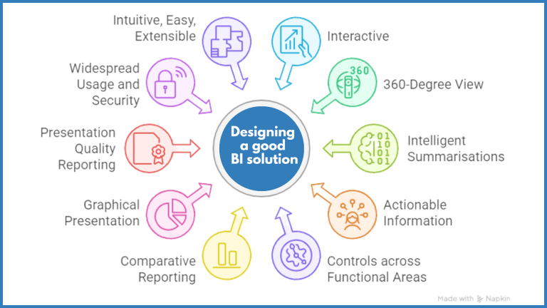
So how should one go about building a Business Intelligence solution which would be useful to all levels of management?

The following ten points coming out of our experience in the practice of BI would help you in designing a good BI solution:

  1. Interactive: This is, of course, the most fundamental requirement of a BI report. The report must be interactive. The user should be able to drag and drop, slice and dice, and create different views of data on his own. There should be a method of creating and storing views of the report. Generally, from the same BI report, various views can be developed by the user. However, if he must do this each time, it becomes unproductive. There should be a mechanism of storing views and then recreating them at the click of a button. The BI designer should interact with the key users of the report and identify views which are likely to be important from a decision-making viewpoint.

  2. 360-Degree View: A good BI solution should permit a cross-functional view of the enterprise. If you take the high-level balance sheet/P&L statement as a starting point, you should be able to see all aspects of the business.
    • For example, when you are seeing the P&L Statement, you should be able to drill down to the product-wise sales/contribution. One of the first interests of management when they see a drop/increase in sales is to identify the products causing it. If they must refer to another report for answering this question, the timeliness and context of the information will be lost, leading to a failure of BI reporting. As product-wise details are rarely held in the General Ledger Chart of Accounts, this would mean combining the P&L Statement details with the Sales & Contribution statement where appropriate. If the number of products is very large, you may include only the top 10 products causing the variation.
    • Another example is when Sundry Debtors (Accounts Receivable) balance is seen in the Balance Sheet you should be able to see your top nn debtors. Again, one of the key concerns of management, when they see an increase in account receivables, would be to identify the top debtors. This would mean integrating the AR details along with the financial details to enable drilling down to the AR and its ageing.

  3. Intelligent Summarisations: Every BI report should have intelligent summarisations. The report should permit drilldowns from these summarisations into underlying details. I would like to distinguish the intelligent summarisations from natural summarisations. There will always be some natural summarisations, like those on time dimensions (sales by month) or by geography dimension (sales by country), etc. Once the dimensions are identified, these summarisations will be provided by the BI tools themselves. By intelligent summarisations, I mean those which will give an even better picture of the underlying data.
    • For example, if you are studying inventories, a dynamic classification into ABC classes (value-based) or FSN classes (Fast/Slow/Non-Moving) or inventory turns would give a much better picture than just classifying inventory by its category.
    •  Another example of inventory summarisation would be to analyse the inventory increases by quantity variance and price variance.
    • In the area of sales analysis, a dynamic summarisation into sales by amount categories, example, 0-1 million, 1-5 million, etc., would give a much better picture along with the other natural summarisation. The user should then be able to drill down from these summarisations to the lowest detail to identify problem areas.

  4. Actionable Information: The BI report should help in triggering actions. The report should therefore not only identify a problem area but also identify the person responsible for taking the relevant corrective action. The report should help in easily identifying exceptions. For example, if you are seeing an Accounts Receivable statement, the open invoices should be summarised by reasons and the collector (the person responsible for collecting the invoice).
    • For example, in an engineering project, business open invoices could be classified collector-wise and further classified into the following reasons:
      1. Normal
      2. Installation Problems
      3. Short Supply Problems
      4. Incorrect Rates
      5. Deduction Against TDS, Etc
    • Another example is creating a report for an FMCG company which identifies slow/non-moving items in inventory in one geographical area, finding whether the same item is a moving item in another area, and creating a stock transfer recommendation report.

  5. Controls across Functional Areas: The design of the BI reports should ensure that key financial controls across different functional areas must tally to create a very high level of confidence in the numbers.
    • For example, if the sales as per the sales analysis module and that as per the general ledger do not match (example debit/credit note entries passed directly in GL), then this should be identified, and such entries should be shown in the sales analysis module as a separate exception item so that the overall numbers match.
    • Similarly, if the inventory value as per the inventory module and the inventory value as per the general ledger do not match, then this difference should be identified as a separate line and shown in the inventory statement. It should be shown as a separate exception item so that the overall numbers match.

  6. Comparative Reporting: Wherever possible, the report should include comparisons with some norms. The comparison can be with budgets, forecasts, the previous year’s numbers, industry standards, etc. The key question to be answered should be, ‘How are we doing in comparison with …?’. As is generally the case, comparative reporting has much greater impact than absolute numbers. For example, if the year-on-year growth of my company is 30%, it sounds impressive, but if the year-on-year growth of the industry to which my company belongs is 60%, then my company’s growth rate pales.

  7. Graphical Presentation: Senior managers have very little time to read through tabulations of data and decipher trends themselves. Graphical presentation strikes home the point immediately. Try to make your reports as graphical as possible, but without loosing their interactivity. For example, if you are seeing the yearly trend of sales for the entire country, you should be able to see the trend for a particular product or for a particular territory also in the same report.

  8. Presentation Quality Reporting: The reports from the BI solution should be directly presentable to the different managerial levels, without having to put them in any other presentation tool. There should be no manual intervention between the BI tool and the report given to management so that there is no possibility of any changes. This would mean that particular attention is given to:
    • Field names should be understandable by the user, and should not be database field names
    • Report layout, formatting and its colouring should be very pleasing to the eye .
    • Numbers should be in lakhs/millions, etc., without decimal points, so that there is no unnecessary clutter on the report.

  9. Widespread Usage and Security: BI reports should not be just available to the elite few of an organisation. It should not appear that the elite few have tools by which they can ‘catch’ others. The BI reports with their analytical abilities should be available to all as per their requirements. After all the purpose is to improve the working of the entire organization. Because these should be widely used, they should also have adequate security. A person should be able to see only that data which is relevant to him or which he is authorised to see. There should also be adequate protection to prevent such BI reports from being sent to unauthorised persons or used by ex-employees of the company.

  10. Intuitive, Easy, Extensible: The design of the BI reports should be very intuitive, and they should be very easy to use and navigate. If the user has to use a new tool for this purpose, the chances of failure of the BI initiative are very high. The BI tool should also be extensible by the user. If he wants to use the data to generate some projections or create different views, he should be able to do so easily and intuitively and without the help of IT support.


In our practice we have observed that only in very rare situations can intelligent BI reporting be done straight out of the data coming from ERP. In real-life scenarios a very large number of business rules have to be applied, data from non-ERP databases has to be integrated and various additional dimensions (intelligent and natural) must be created in order to make the data reportable. The intelligent BI reporting environment actually becomes an application in its own right.

About the author