Simplicity in Dashboard Design
In her novel The Fountainhead, Ayn Rand explores the concept of “form follows function” through the character of Howard Roark. Roark, an innovative architect, passionately believes that the design of a building should be driven by its purpose rather than by conventional or decorative elements. This principle is vividly illustrated in his architectural creations, where every aspect of the design serves a specific function.
I strongly believe that this philosophy is not limited to architecture; it is equally relevant to the design of dashbards. Just as Roark’s buildings are shaped by their intended use, a well-designed dashboard should prioritize functionality and clarity. Each element on the dashboard should have a clear purpose, contributing to the overall effectiveness of the data presentation.
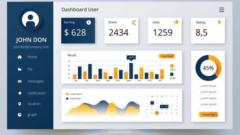
Imagine a dashboard that tells a story. Instead of cluttered visuals and unnecessary decorations, it presents data in a way that is intuitive and easy to understand. The layout is clean, with each chart and graph serving a specific role in conveying the narrative. This approach ensures that users can quickly grasp the insights they need, much like how Roark’s buildings seamlessly blend form and function to serve their occupants.
By applying the “form follows function” principle to dashboard design, we can create tools that are not only aesthetically pleasing but also highly functional, enabling users to make informed decisions with ease.
The following article emphasizes this principle in a storytelling format.
Global Tools Ltd., an (imaginary) Indian multinational, professionally managed company, faced a similar challenge. The Managing Director (MD) and Mr. Wagh, the MD’s consultant, reviewed an elaborate dashboard designed by a reputable agency. Despite the use of the latest technology and impressive visuals, the dashboard failed to address key issues.
Wagh: Sir, I took the liberty of engaging a small but niche company specializing in developing powerful and insightful dashboards. The person is waiting outside. If you permit, I will call him in.
Rohan enters the room, dressed in jeans and a T-shirt, looking a bit dishevelled from working late. The MD’s face registers doubt about Rohan’s competence compared to the other agency.
Rohan: Sorry, Sir. I was working late last night making final changes to the dashboard. After Mr. Wagh’s briefing, I discussed requirements with many of your team members in Sales. I studied the current reports and asked them what they were looking for. They provided a lot of clarity.
The MD is surprised by Rohan’s approach and warms up to him. Unlike typical consultants who ask for a specification document, Rohan took the initiative to understand the team’s needs.
Rohan connects his laptop, revealing a simple yet elegant dashboard.
Rohan: Sir, I noticed that senior executives may not have time to review the dashboard in detail each day. Therefore, I created a Summary Page showing critical metrics. This page compares the company’s sales with the Annual Operating Plan (AOP) and calculates the required run rate per day to catch up with the AOP. If the required run rate is less than the AOP run rate, all is fine. If not, you need to dive into details.
MD: You seem to have used cricketing terminology, but I get the gist. Is this data updated up to yesterday? Can you show me these numbers by major divisions?
Rohan presses a key, displaying the division-wise AOP vs. actual sales, updated up to the close of business hours yesterday. The MD then asks for a zonal breakup, product category breakdown, and further drilldowns, all of which Rohan shows with ease.
The MD, noticing some concerning numbers, calls the Sales head of one division. He then asks Rohan to drill down into product groups, which Rohan does with a single key click, highlighting underperforming product groups with a red KPI icon. The discussion continues, and the MD schedules a meeting with the Sales head.
Wagh: Sir, did you see the power of this dashboard? In the other dashboard, you had to hunt for numbers and insights. But in this dashboard, you can drill down from the top level to problem areas easily. The visuals are simple, and the page is uncluttered and easy to read. There is no need to scroll.
MD: I must say I like this. The simplicity of the dashboard conceals a lot of power. Thank you, Rohan, for your direct approach to understanding our requirements. The dashboard looks so easy that I will be able to navigate it myself for my meeting with the Sales heads.
Design Principles:
1. Adopt the universal principle of “Form follows function”.
2. Discuss with end users to identify their decision-making needs.
3. Innovate on metrics and KPIs to make users’ jobs easier.
4. Design reports with varying levels of detail for different hierarchy levels. Users should have the flexibility to drill down intuitively.
5. Keep the page uncluttered and simple. Use simple visuals like cards, bar charts, line charts, and matrices to convey messages effectively.
6. Iterate with end users during development. Take their feedback on each page to minimize rework and ensure faster delivery. This process makes users feel involved and invested in the design.
7. Continue iterating after the first version is finalized. Regularly check for new insights required every couple of months.
About the author